Loading…
Brand identity
Venture studio
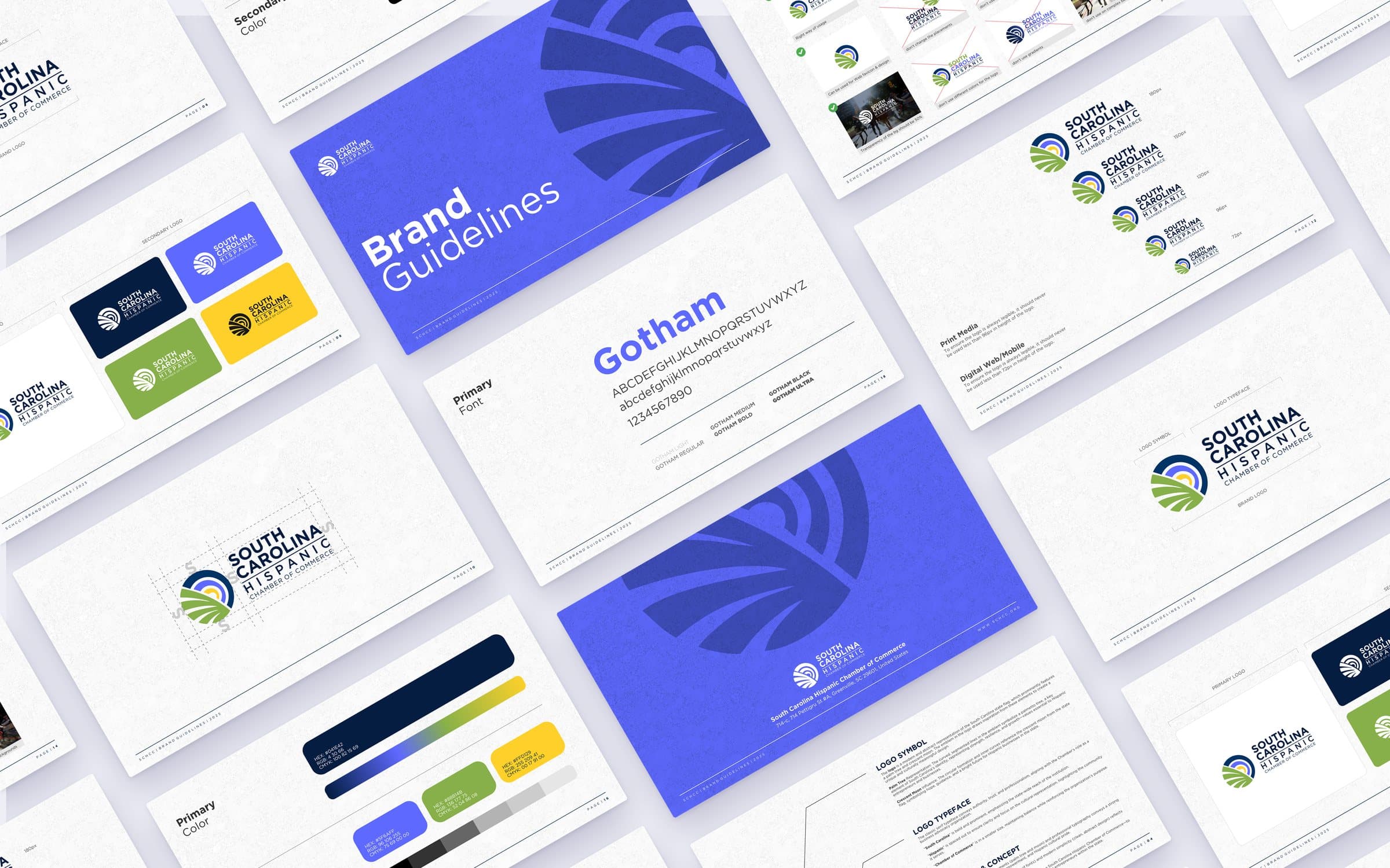
A bold, modern identity for a venture studio, documented in guidelines so the studio and the companies it builds can apply it consistently.
- Client
- A venture studio that builds and backs new companies.
- Type
- Brand identity
- What we did
- Logo & identity system
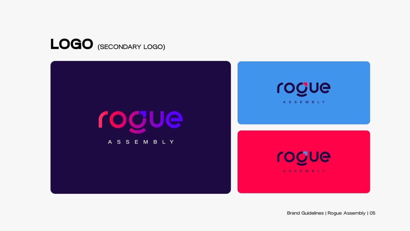
- Secondary logos
- Color palettes
- Typography
- Brand guidelines
What we built
The details that do the work.
- 01
A logo system, not just a logo
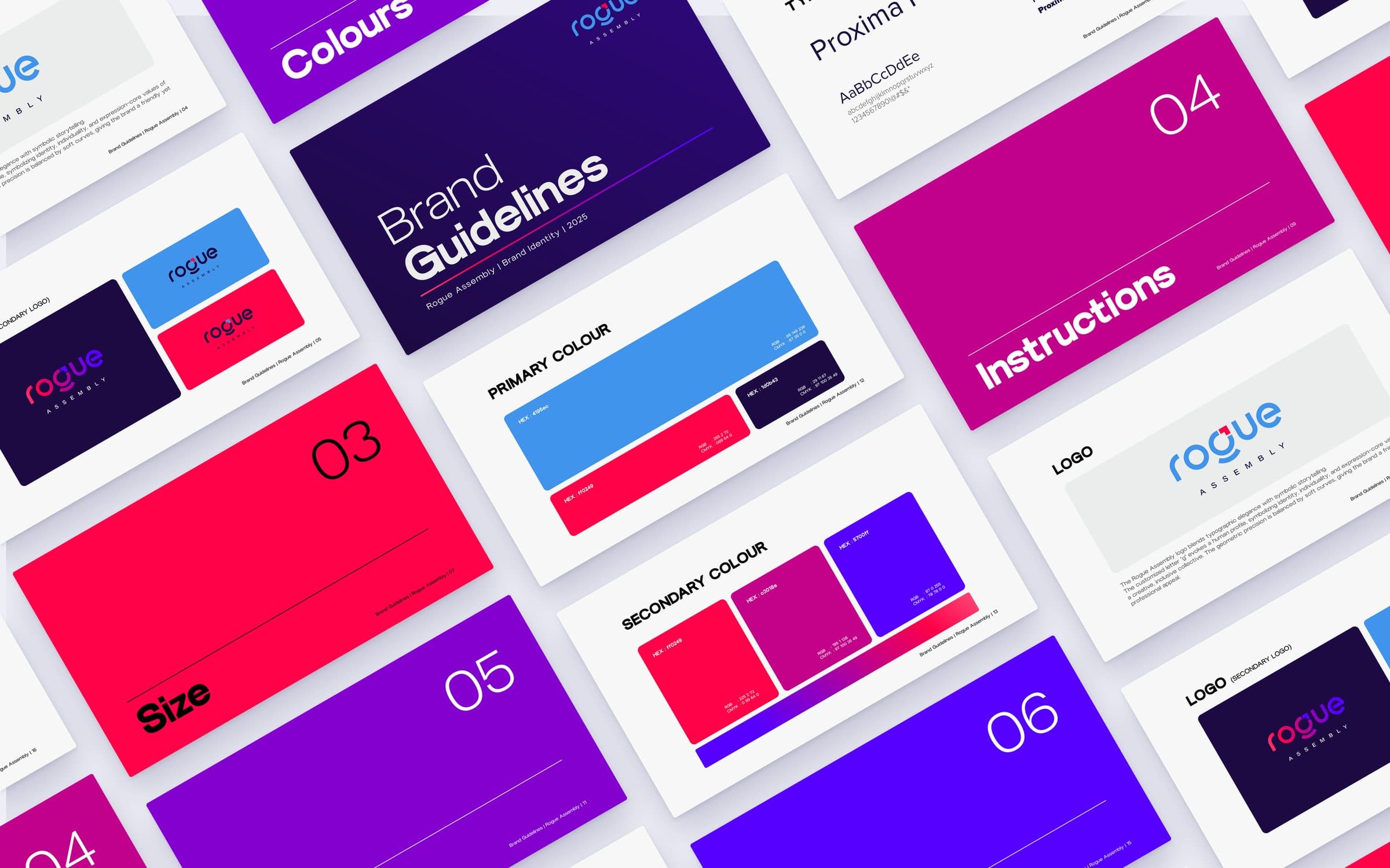
Primary and secondary lockups on light, dark and color backgrounds, with clear-space and minimum-size rules for print and digital.
- 02
Do’s and don’ts
Plain examples of correct and incorrect usage keep the mark consistent in other people’s hands.
- 03
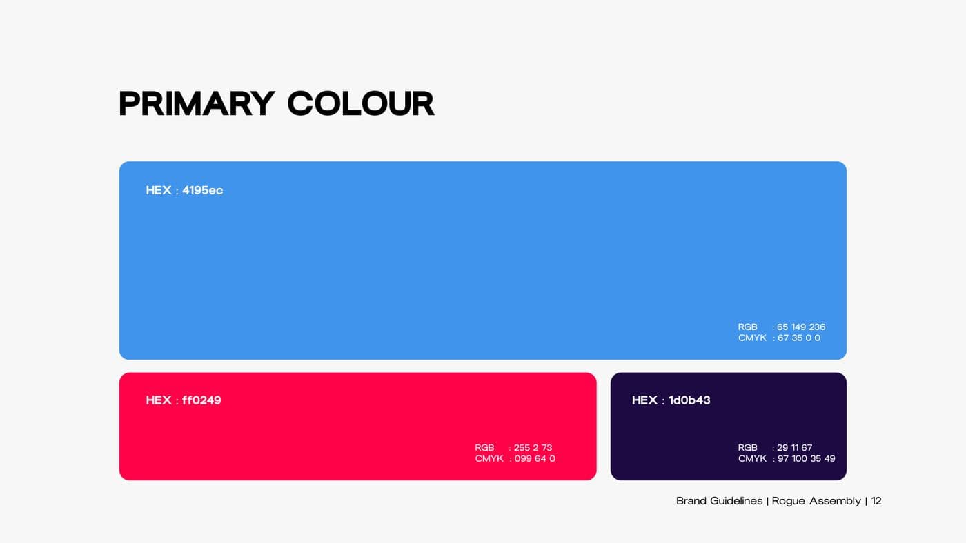
A vivid palette
Primary, secondary and additional colors with exact values for screen and print.
- 04
Typography that scales
A primary and secondary typeface pairing with a full weight range for headlines through body copy.
Inside the guidelines
Every piece, documented.

Want something like this?
Tell us what you’re building. We’ll help you think it through, then build it.